

Tropicfeel Pick the shoe first. The size can wait.
Premium travel sneakers in the UAE. We cleared the collection grid, answered size and fit at the button, and turned search and the cart into places that sell.
Visit the live store (opens in a new tab)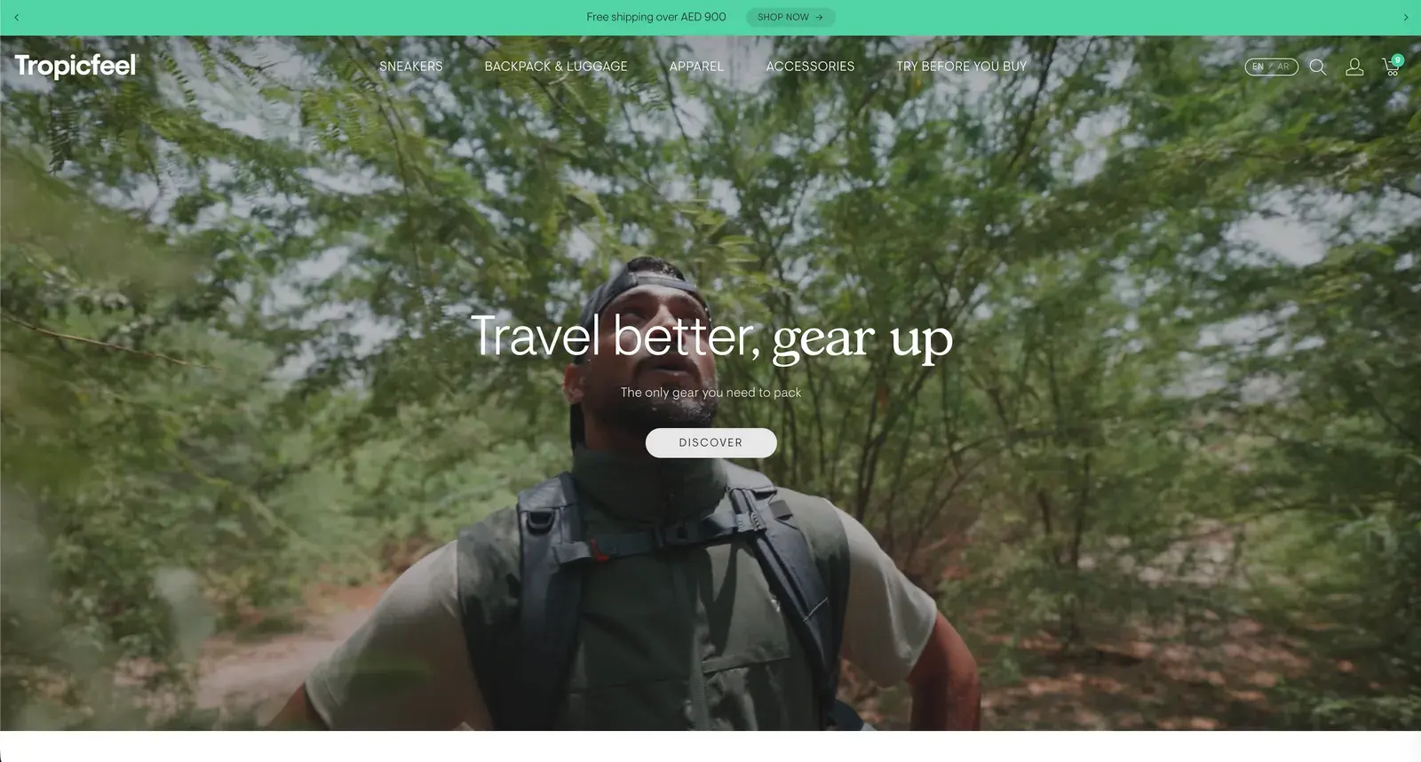
The brief
Travel sneakers at around AED 600, many in a dozen colourways or more. Shoppers had to choose a size on the collection page before they'd even chosen a shoe.
- Store
- tropicfeel.ae
- Market
- UAE, in English and Arabic
- Catalogue
- 64 sneakers, plus bags, apparel and accessories
- Our part
- Menu, collections, product page, search and cart
We judge every screen on four things
Cognitive ease
Less to read and less to decide on every screen. It matters most.
Navigation
The right product in as few taps as possible.
Structure
What each page shows, in the order people need it.
Journey
No dead ends between the first visit and the checkout.
01Home page
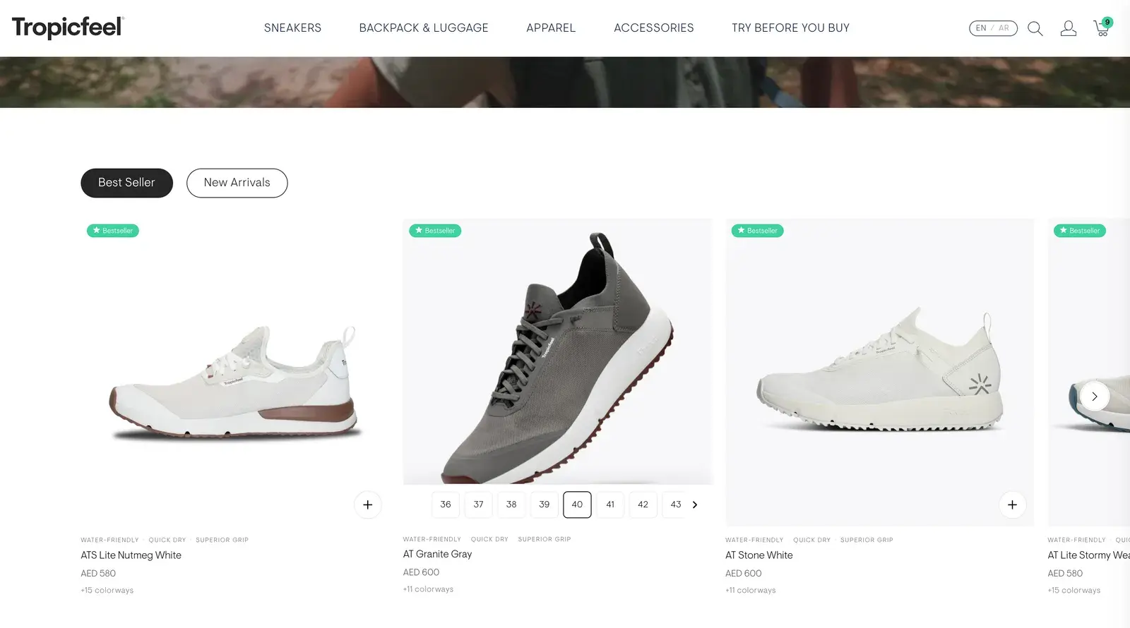
Browse and buy in one place. Sizes on the card.
The home page slider showed names and prices, nothing else. Every purchase meant a trip to a product page.
- Journey
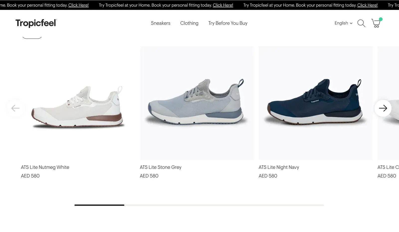
Before: One slider of names and prices
After: Best seller and New arrivals, a tap apart
Before: Open each shoe to buy it
After: Hover, pick a size, and it's in the cart
Before: Nothing on what the shoe is for
After: Water-friendly · Quick dry · Superior grip on every card
02MenuNew
A menu for how people shop. By style, by model, or what's new.
Sneakers, Clothing and Try Before You Buy became five sections, with bags and accessories out in the open. Sneakers open on what people choose by: featured, style and model.
- Navigation
- Structure
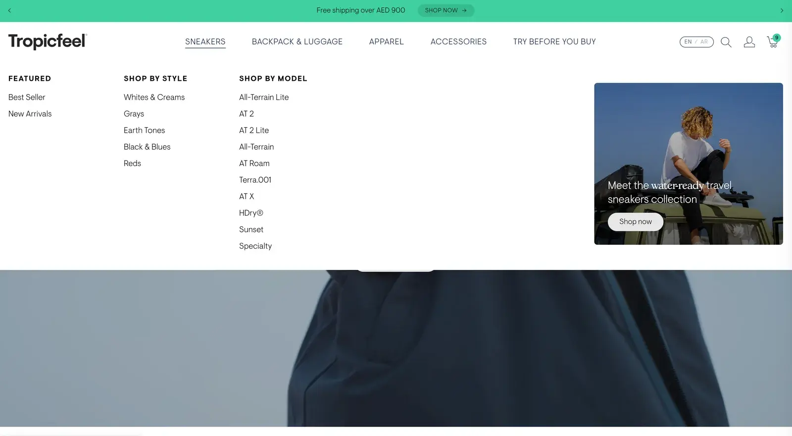
Sneakers: featured, shop by style, shop by model, and the newest collection. 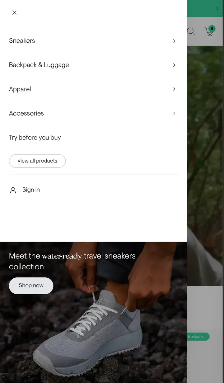
On a phone: the five sections, sign in, and the newest collection.
03Collection page
Choose the shoe first. The size comes later.
Every card asked for a size before anyone had picked a shoe. Sixty-four of those in a grid is a wall of decisions.
- Cognitive ease
- Navigation
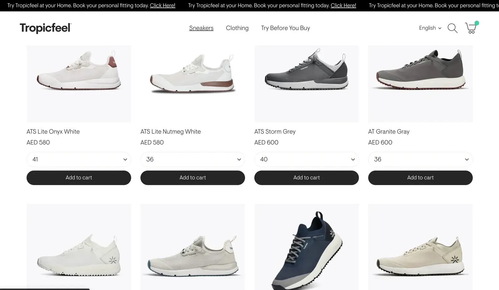
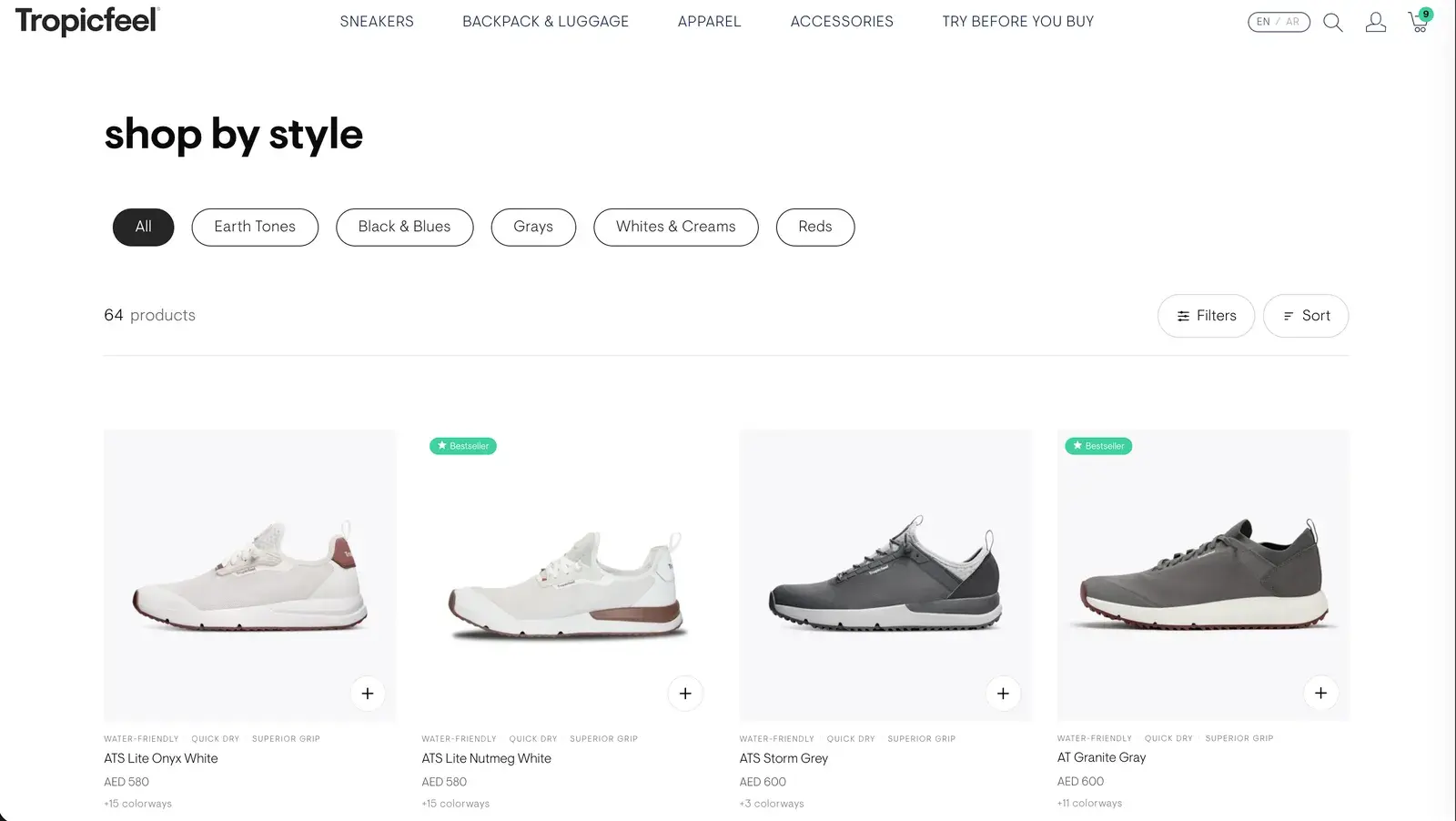
Before: A size dropdown and Add to cart under every shoe
After: A clean card, and a + to quick add when you're ready
Before: 64 sneakers in one long grid
After: Shop by style: earth tones, black & blues, grays, whites & creams, reds
Before: A name and a price
After: What it's made for, and how many colourways it comes in
Before: Best sellers unmarked
After: A Bestseller badge where it counts
04Product page
Size and fit, answered at the button. Before anyone has to ask.
Fit is the first doubt when buying shoes online. The old page had a scale but no advice, and hid the sizes in a dropdown.
- Cognitive ease
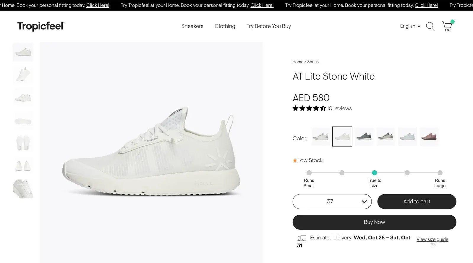
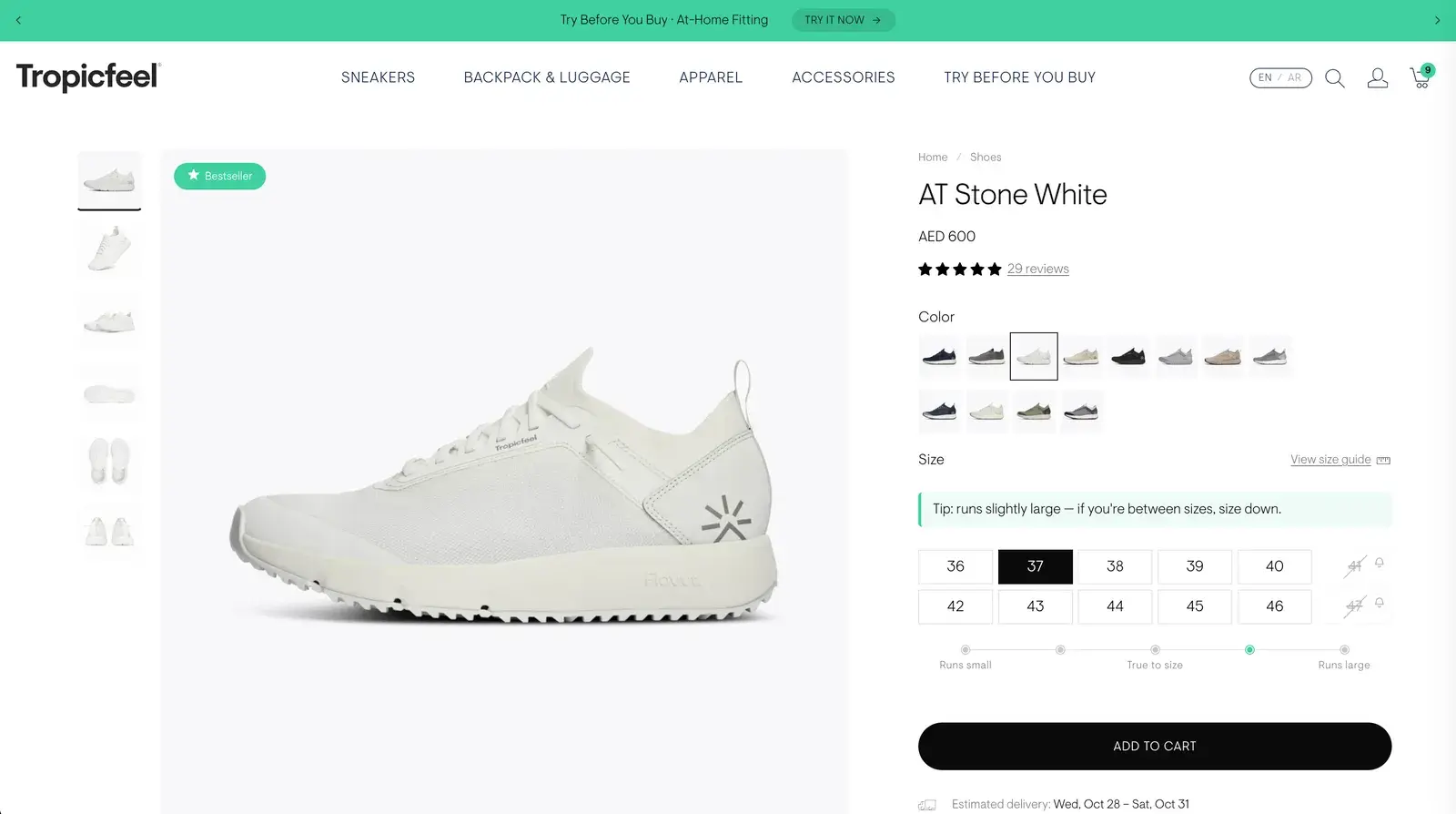
Before: Sizes hidden in a dropdown
After: Every size on show, sold-out ones crossed out with a bell to get notified
Before: A fit scale with no advice
After: “Runs slightly large — if you're between sizes, size down.”
Before: Add to cart and Buy now side by side
After: One Add to cart
Before: “Try Tropicfeel at your Home… Click Here!” scrolling past
After: “Try Before You Buy · At-Home Fitting”, with a button
05Search
Search that shows before you type. And never leaves the page.
Search used to open a page of its own with an empty box. Now it slides over the page you're on, with the most popular sneakers already in it.
- Navigation
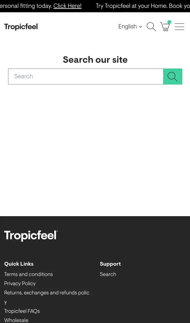
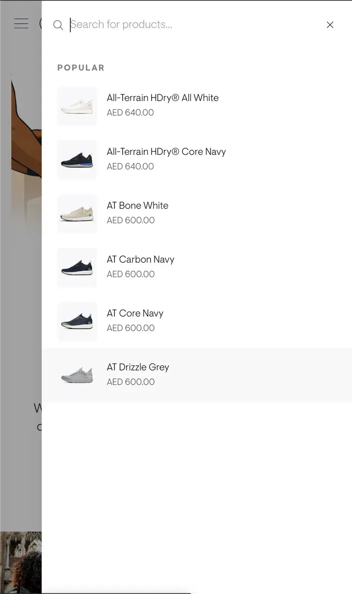
Before: A separate page with an empty box
After: A drawer over the page you were on
Before: Nothing until you type
After: Popular sneakers, with their prices, before the first letter
06Cart
Something to aim for. The next reward always in sight.
The cart was a list and a button. Now it shows how close the next reward is, and what goes with what's already in it.
- Journey
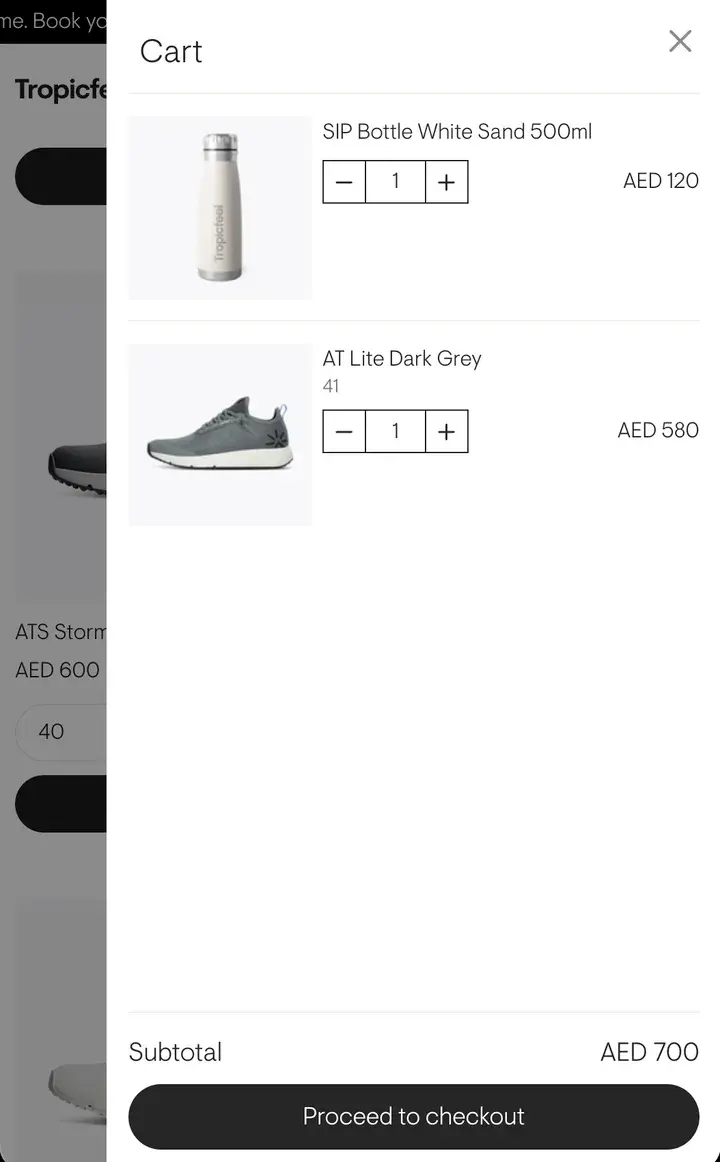
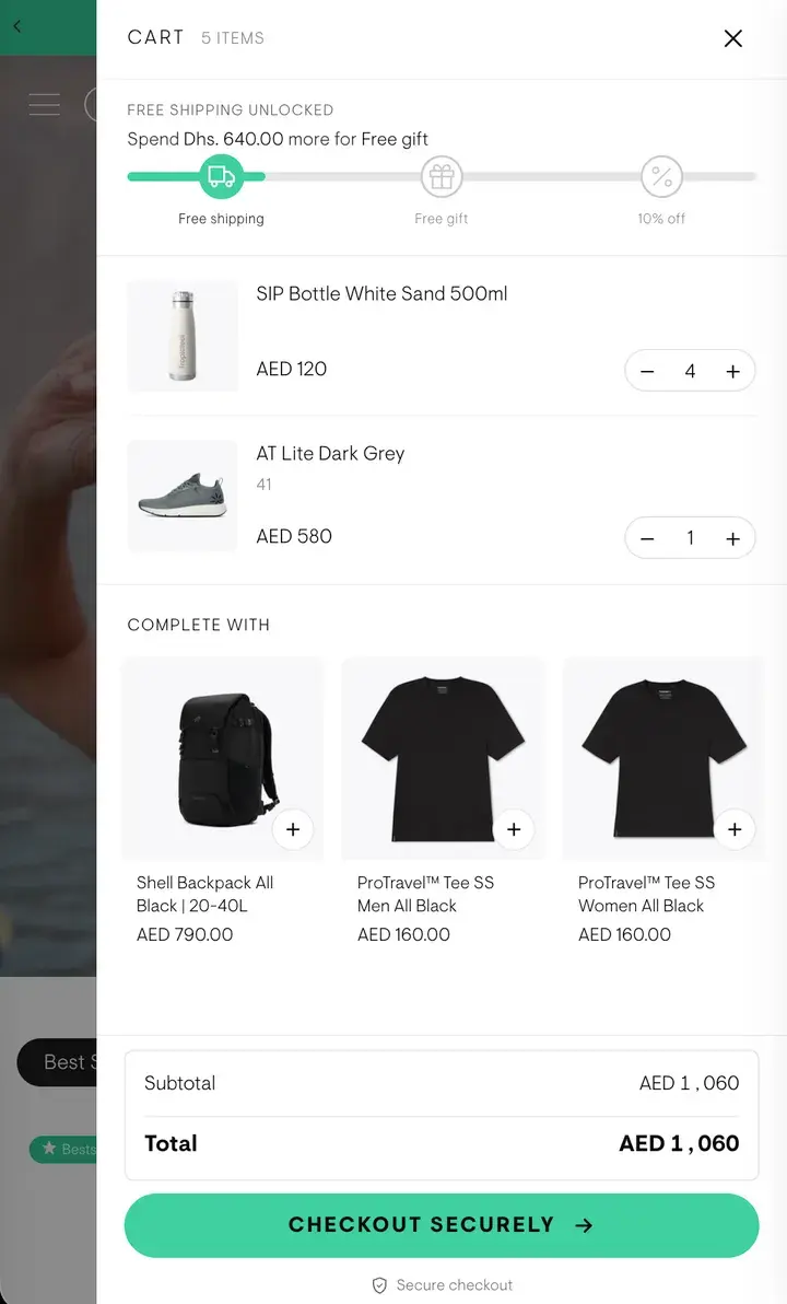
Before: A list and a subtotal
After: A bar with three rewards: free shipping, a free gift, then 10% off
Before: Nothing to add
After: “Complete with”: a backpack and tees, one tap each
Before: “Proceed to checkout”
After: “Checkout securely”, in the brand's green