

Sprayo 30% more revenue from every visitor.
A premium home spray at about six times the price of a supermarket can. We rebuilt the store so the reason shows before the price does.
Visit the live store (opens in a new tab)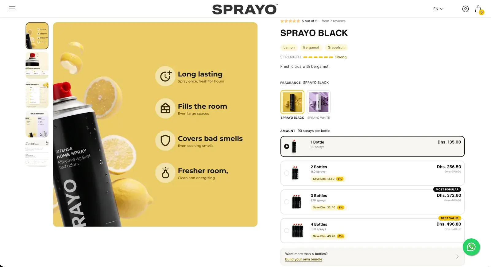
The brief
Sprayo costs about six times a supermarket air freshener, and the store never said why. Make the price make sense, then move the order past one bottle.
- Store
- trysprayo.ae
- Market
- UAE, 9 in 10 visits on a phone
- Launched
- 22 September 2026
- Our part
- Audit, redesign and Shopify build
We judge every screen on four things
Cognitive ease
Less to read and less to decide on every screen. It matters most.
Navigation
The right product in as few taps as possible.
Structure
What each page shows, in the order people need it.
Journey
No dead ends between the first visit and the checkout.
01Results
More revenue from every visitor. Measured on the live store.
Shopify Analytics, from the launch on 22 September to the end of October 2026, against the months before.
Revenue per session
+30%
Per visitor, so the rise in traffic at the same time can't inflate it.
Before vs after launchLaunch (22 September 2026) to the end of October, vs before
Cart to checkout
93.5%+12%
Before 83.2%
Flat at 80–85% for four months before. Statistically significant, however the data is cut.
Before vs after launchOctober 2026 vs June–September 2026
Conversion rate, store-wide
4.33%+53%
Before 2.83%
The best of the seven months measured. Statistically significant.
Before vs after launchOctober 2026 vs April–September 2026
Add-to-cart rate
8.63%+8.6%
Previous best 7.95%
The highest of the seven months measured.
Before vs after launchOctober 2026 vs the six months before
02Home page, top to bottom
A home page that sells, top to bottom. Scroll the two side by side.
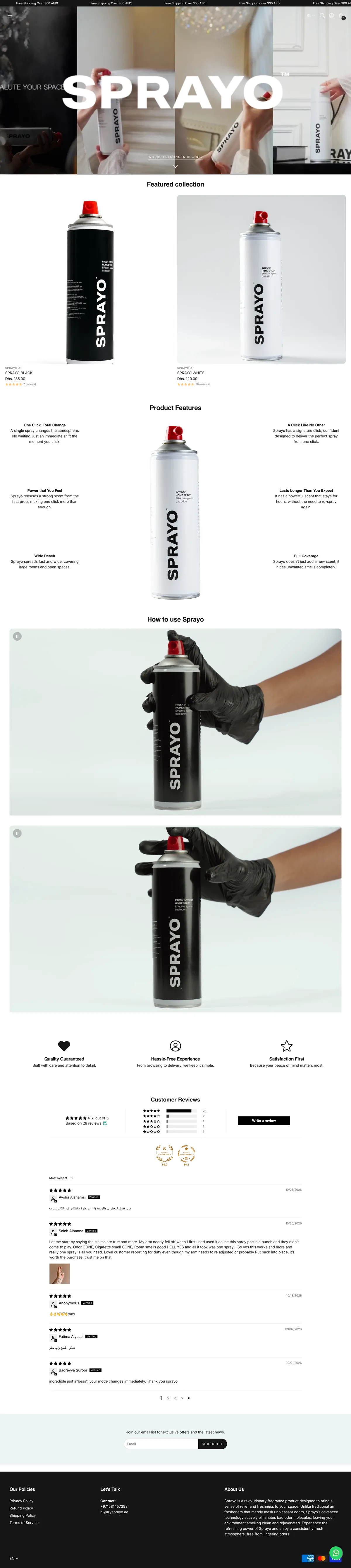
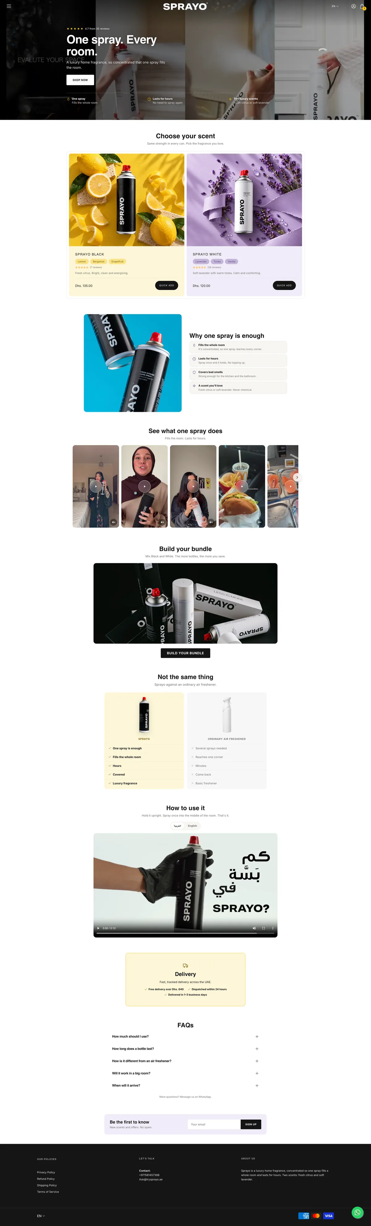
The old home page was big photos, a features diagram and two how-to videos, then every review. The new one makes the case in the order people need it: what it does, which scent, why one spray is enough, proof, bundles, how it's different, how to use it, delivery and questions.
- Structure
- Journey
Scroll inside each page
Before: A full-screen logo over a photo
After: “One spray. Every room.”, the rating and three reasons on the first screen
Before: “Featured collection”: two cans on white
After: “Choose your scent”: each in its colour, with quick add
Before: A features diagram and two how-to videos
After: Why one spray is enough, creator videos, and Sprayo against an ordinary spray
Before: Every review, one after another
After: Bundles, how to use it, delivery and the questions people ask
03Product page, top to bottom
A product page with answers. Not just a button and the reviews.
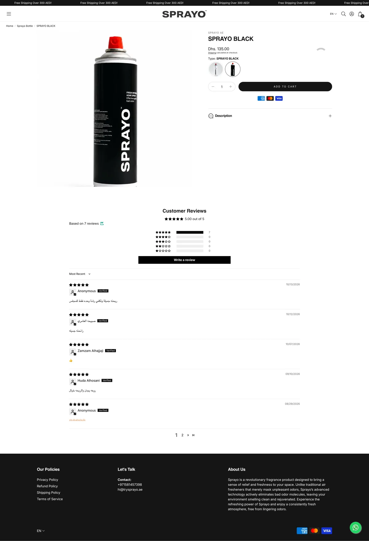
Before, the product page was a photo, a price, a button and the reviews. Now the buy box sells, and below it the page keeps answering: what one spray does, how it compares, the questions people ask and delivery, with the add-to-bag bar in reach all the way down.
- Structure
- Cognitive ease
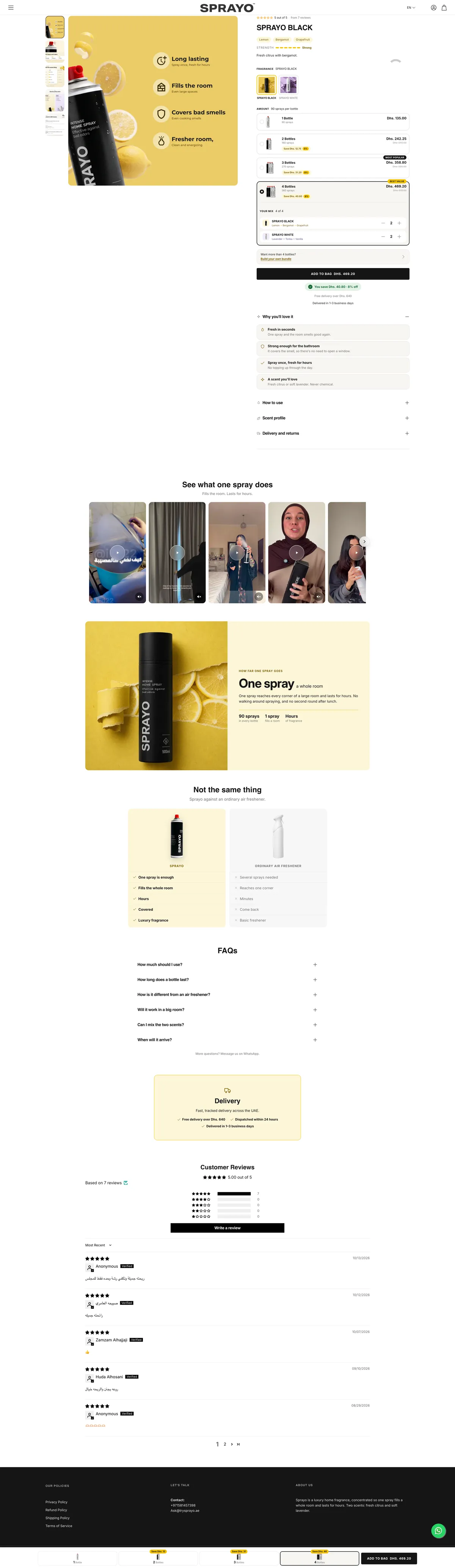


Scroll inside each page
Before: A photo, a price and Add to cart
After: Benefit images, the rating, the scent, and packs with their savings
Before: One “Description” drop-down
After: Why you'll love it, then how to use, scent profile, and delivery and returns
Before: The reviews straight after the button
After: Creator videos, how far one spray goes, and an honest comparison first
Before: No answers to the usual questions
After: The questions people ask, answered on the page
Before: Nothing in reach once you scroll
After: A bar with the packs and Add to bag, all the way down
04Menu
Two links became a shop. Each scent gets its own card.
Nine in ten visitors are on a phone, and the menu is often the first thing they open. It had two words in it.
- Navigation
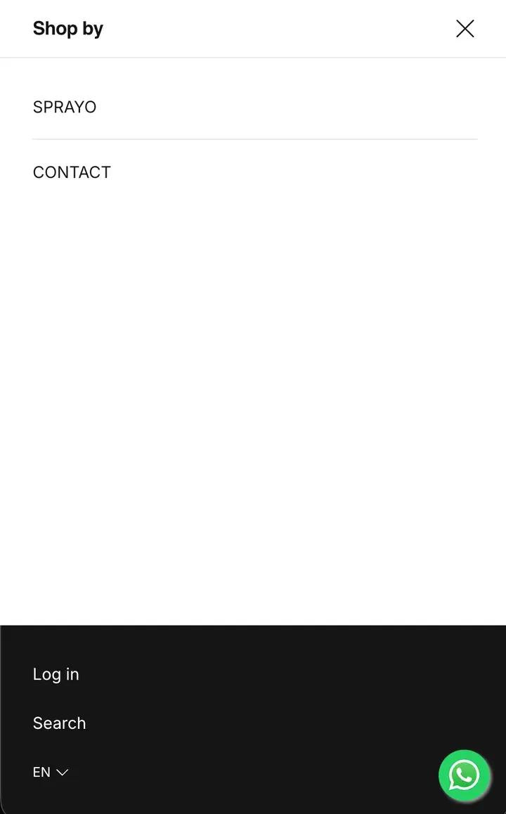
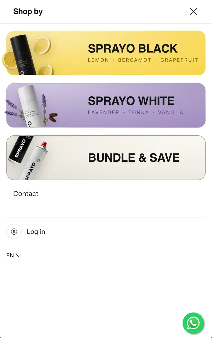
Before: Two text links: SPRAYO and CONTACT
After: A card for each scent, with its colour, its bottle and its notes
Before: Bundles nowhere in sight
After: Bundle & Save, one tap from any page
Before: A search link, for a store with two products
After: No search: two scents don't need one
05Home page
Choose by scent, not by can. Colour, notes and how it smells.
Black and White looked like the same can in two colours. Nobody buys a fragrance they can't imagine.
- Cognitive ease
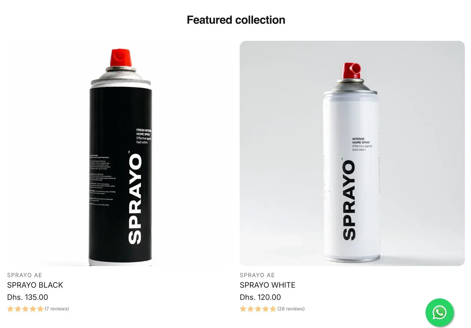
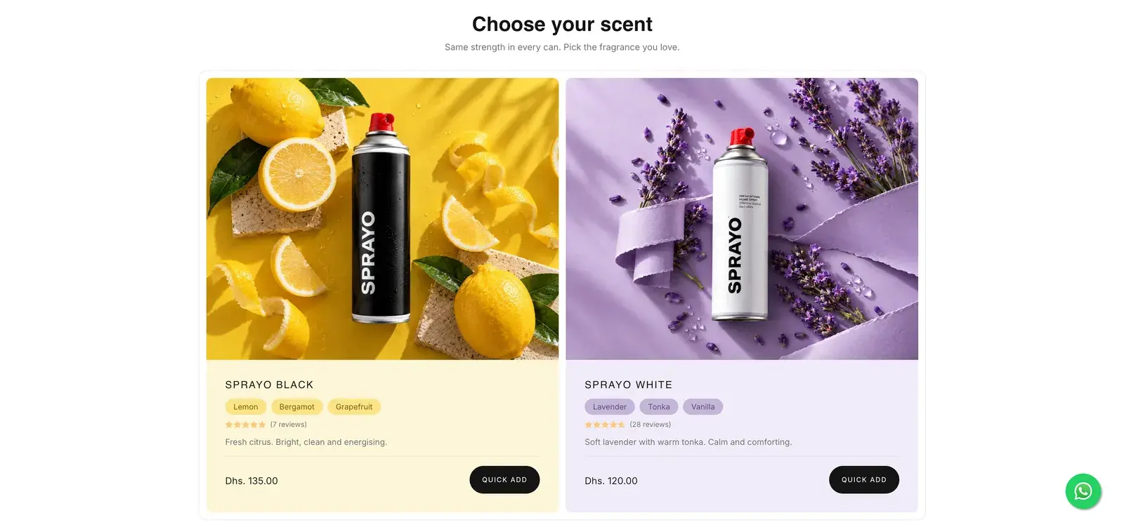
Before: “Featured collection”: two cans on white
After: “Choose your scent”: each fragrance in its own colour
Before: No hint of what either smells like
After: The notes as pills: lemon, bergamot, grapefruit
Before: “SPRAYO AE” above every name
After: One line each: “Fresh citrus. Bright, clean and energising.”
Before: Open the product to buy
After: Quick add on the card
06Product page
Images that sell, not just show. And more of the page above the fold.
Most people never scroll past a product page's first screen. Before, that screen was a photo of the can on white, which says nothing about why it costs more. Now the first image sells the benefits, and on phones it's landscape, so the rating, the name and the scent fit above the fold too.
- Cognitive ease
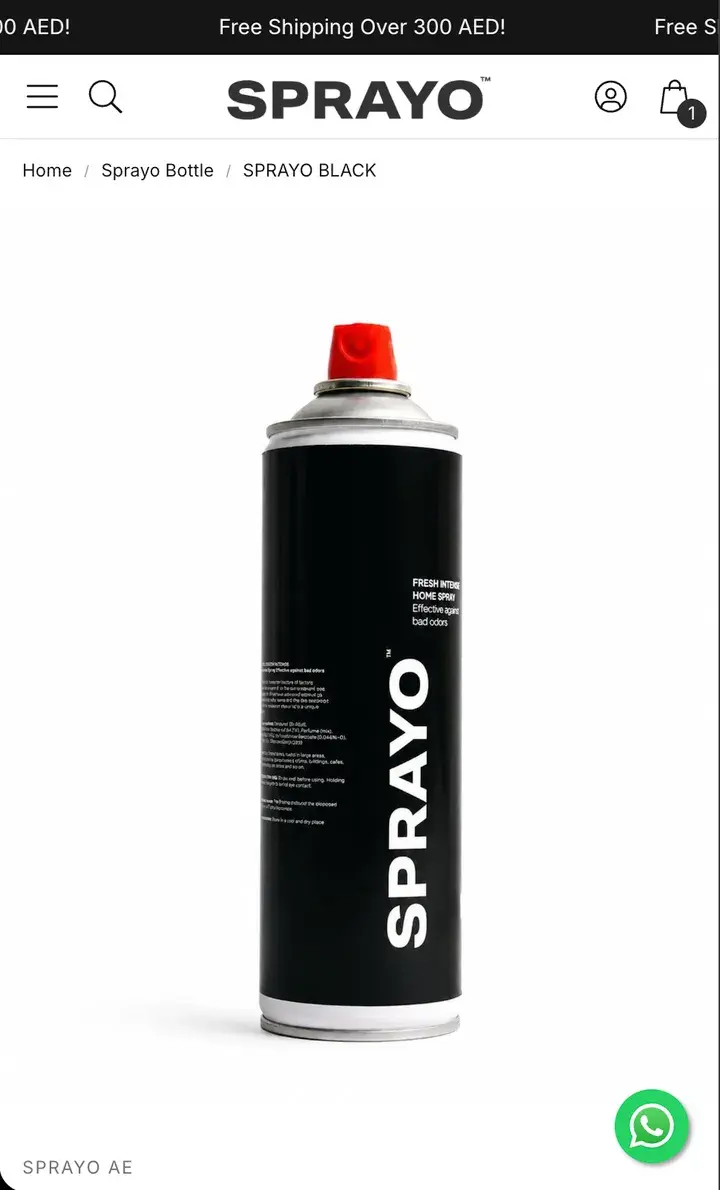
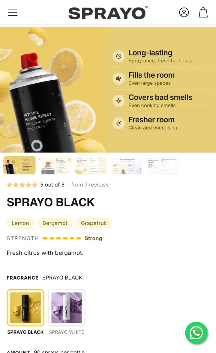
Before: A plain photo of the can on white
After: A benefit image first: lasts for hours, fills the room, covers bad smells
Before: One big photo filling the phone's first screen
After: A landscape image on phones, so the rating, name, notes and strength fit above the fold
Before: Reviews at the very bottom of the page
After: The rating above the name: 5 out of 5, from 7 reviews
Before: Nothing about the scent
After: The notes, a strength scale and one line on the smell
Before: Variants as two round thumbnails
After: Both fragrances as cards in their own colours
07Product imagesNew
One image, two shapes. Square on desktop, landscape on phones.
On a desktop the image sits beside the buy box, so it can be square. On a phone it sits above it, so it's landscape and takes less height. Each image has one job: the benefits, how to use it, against an ordinary spray, the reviews.
- Cognitive ease
- Structure
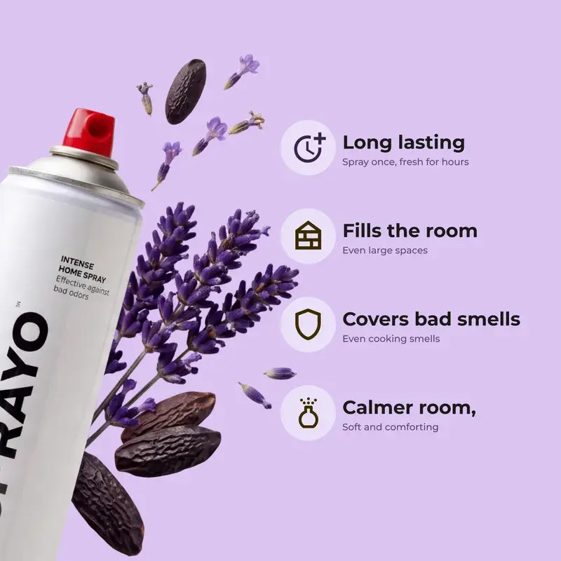
Desktop: the benefits. 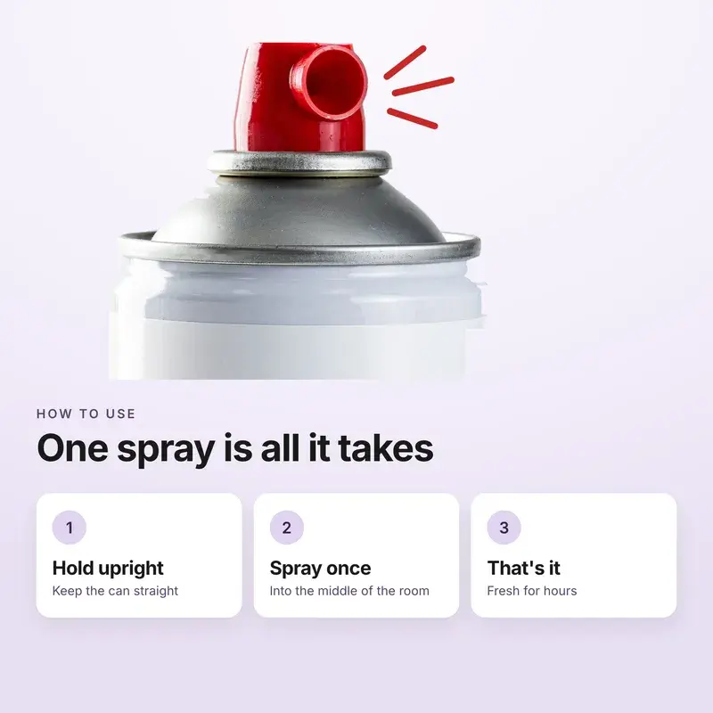
Desktop: how to use it. 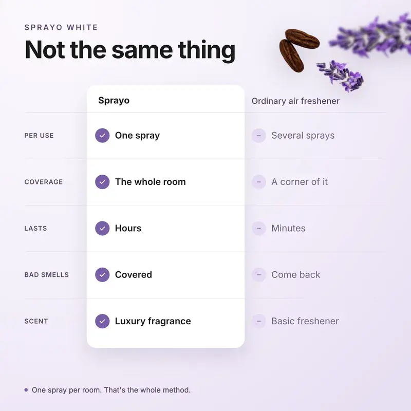
Desktop: against an ordinary spray. 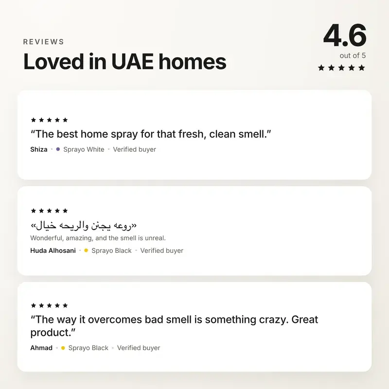
Desktop: the reviews. 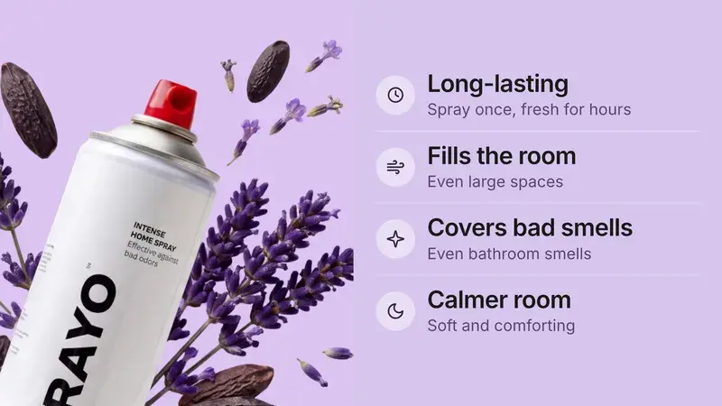
Phone: the benefits. 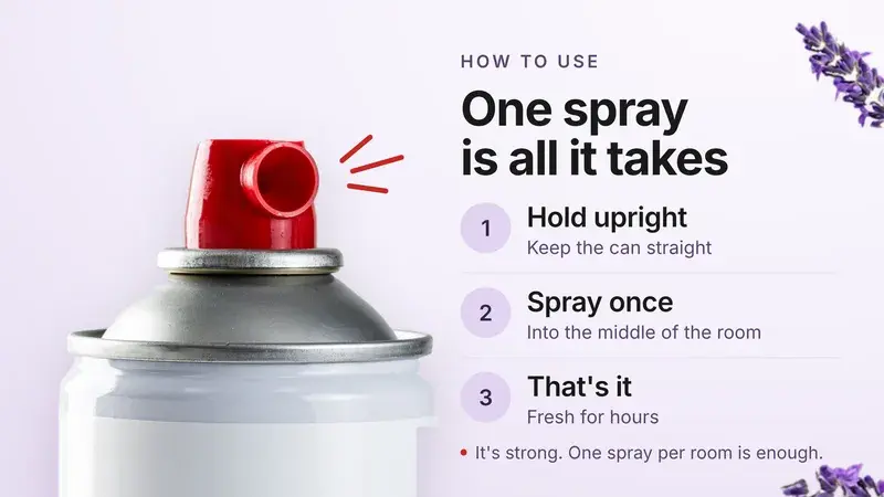
Phone: how to use it. 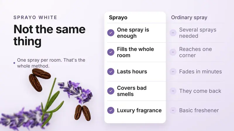
Phone: against an ordinary spray. 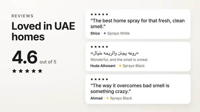
Phone: the reviews.
08Buy box
Savings in dirhams, not maths. And a reason to take two.
Each bottle you add costs less than the last. Before, the only way to find that out was a quantity stepper.
- Cognitive ease
- Journey
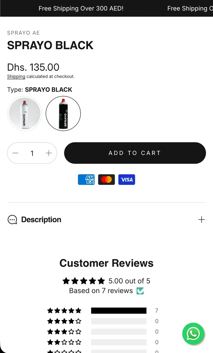
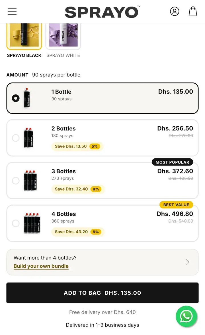
Before: A quantity stepper and one price
After: 1 to 4 bottles as rows, each with its price, its saving and its number of sprays
Before: No word on which to pick
After: “Most popular” and “Best value” marked
Before: “Add to cart”, without a total
After: The total on the button: “Add to bag Dhs. 135.00”
Before: Payment logos as the only reassurance
After: Free delivery over Dhs. 640, and delivery in 1–3 business days, under the button
09BundlesNew
People buy one of each. So every pack mixes both.
78% of two-bottle orders were one Black and one White. Any pack now splits between the two scents, and Build your bundle takes an order past four bottles.
- Journey
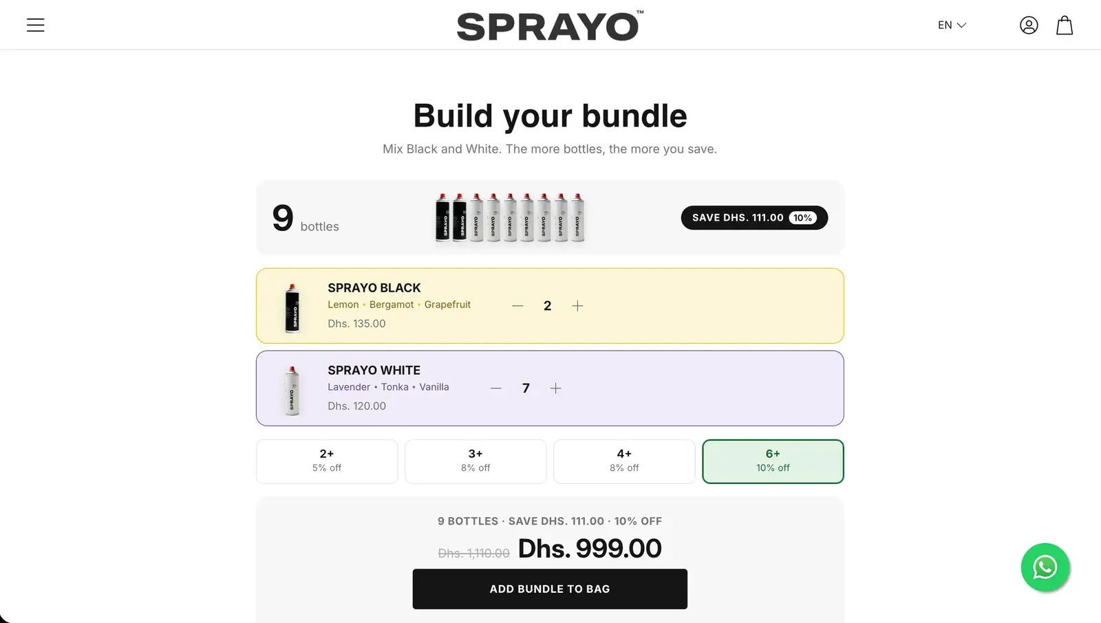
Build your bundle: any mix, any size, with the saving as you go. 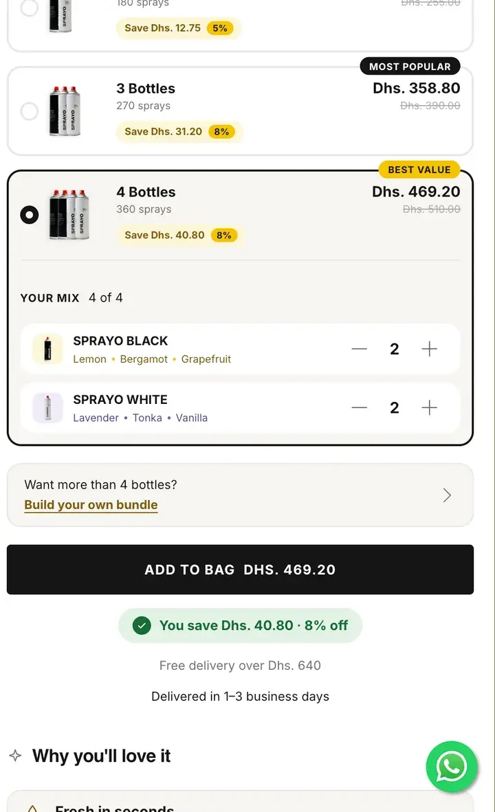
Pick a pack, then split it between the scents.
10How to use
One line, in their language. Arabic or English, one tap.
The old section played two videos and said nothing. The new one says it in a sentence, then shows it, in Arabic or English.
- Cognitive ease
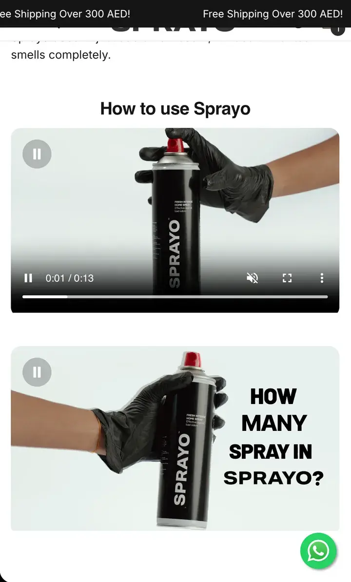
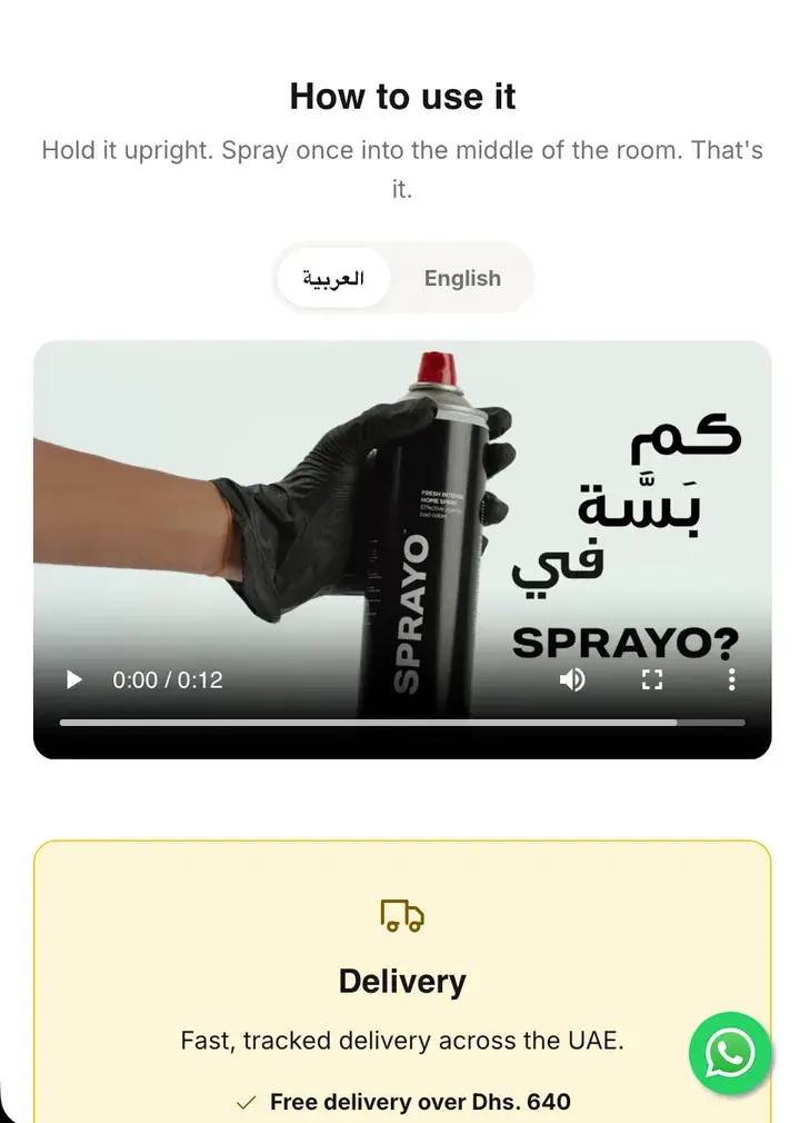
Before: Two videos under a heading
After: “Hold it upright. Spray once into the middle of the room. That's it.”
Before: English only
After: An Arabic / English switch on the video
Before: Delivery explained somewhere else
After: Delivery and the free-delivery line right under it
11Creator videosNew
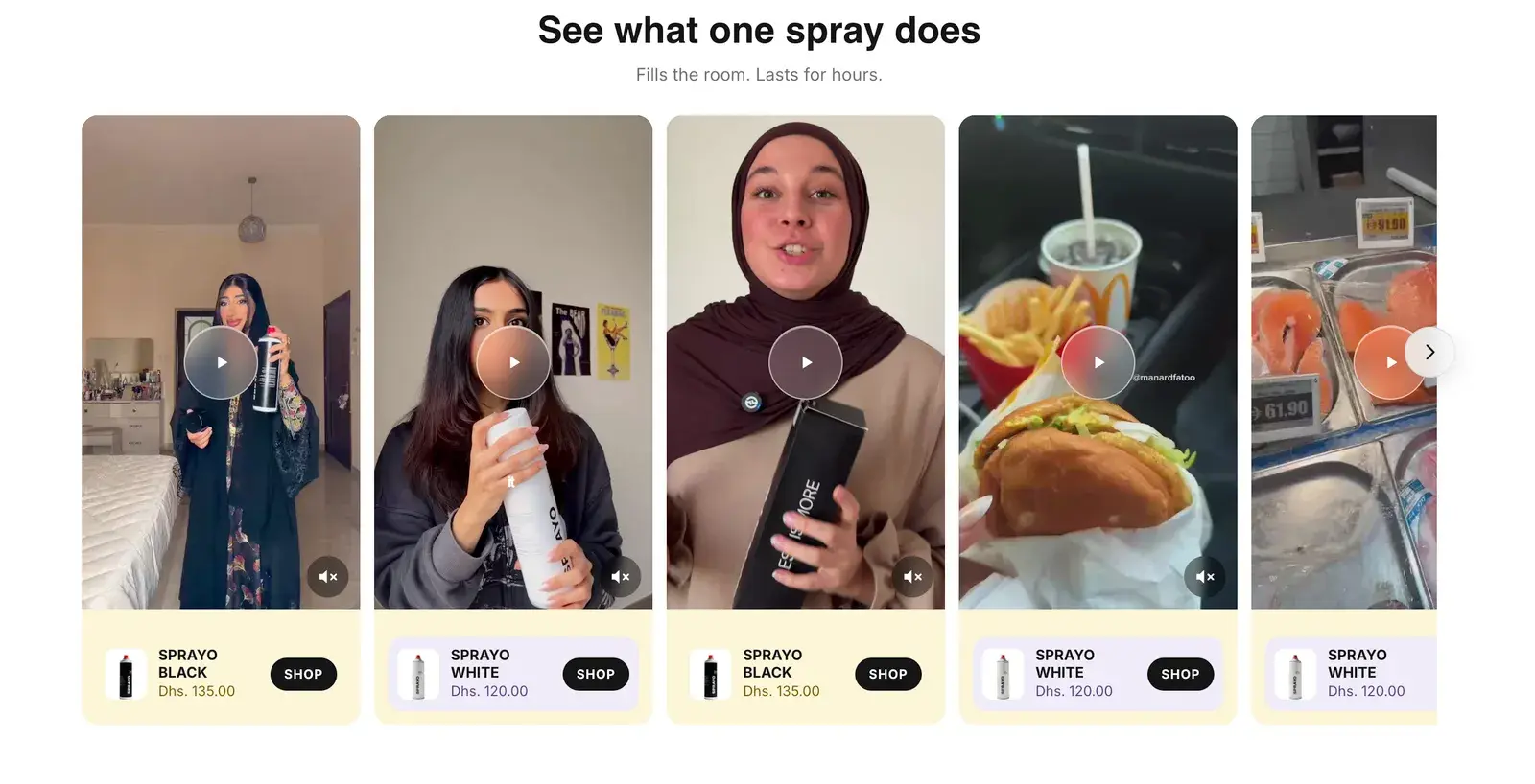
Proof from real homes. Each clip one tap from its bottle.
Eight creator clips in a slider, one playing at a time. Each card names the bottle in the clip and adds it to the bag.
- Cognitive ease
12Cart
An empty cart that still sells. No more dead end.
People open the cart before they've added anything, to check the price or the delivery. It used to send them away.
- Journey
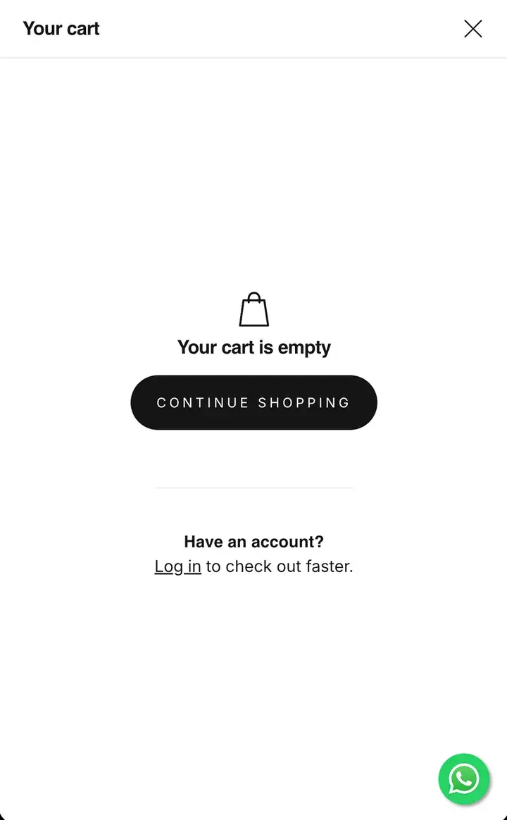
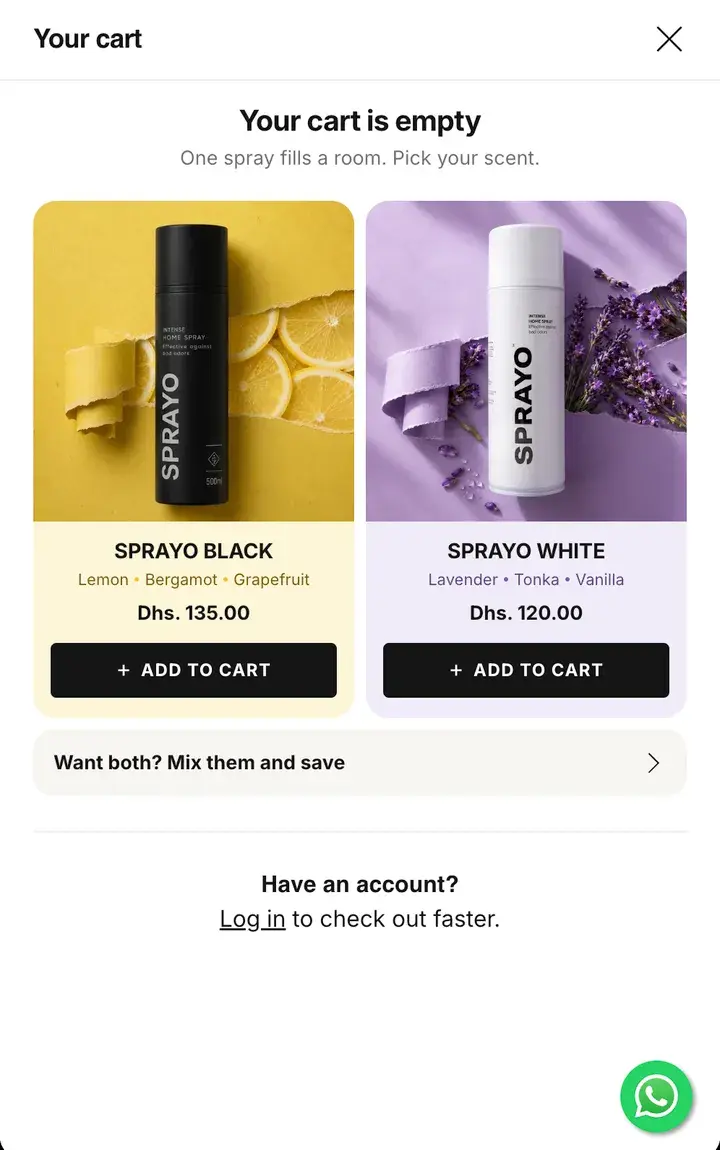
Before: “Your cart is empty” and Continue shopping
After: Both scents, with Add to cart right there
Before: Nothing to look at
After: Each bottle on its colour, with its notes and price
Before: No word about bundles
After: “Want both? Mix them and save”